

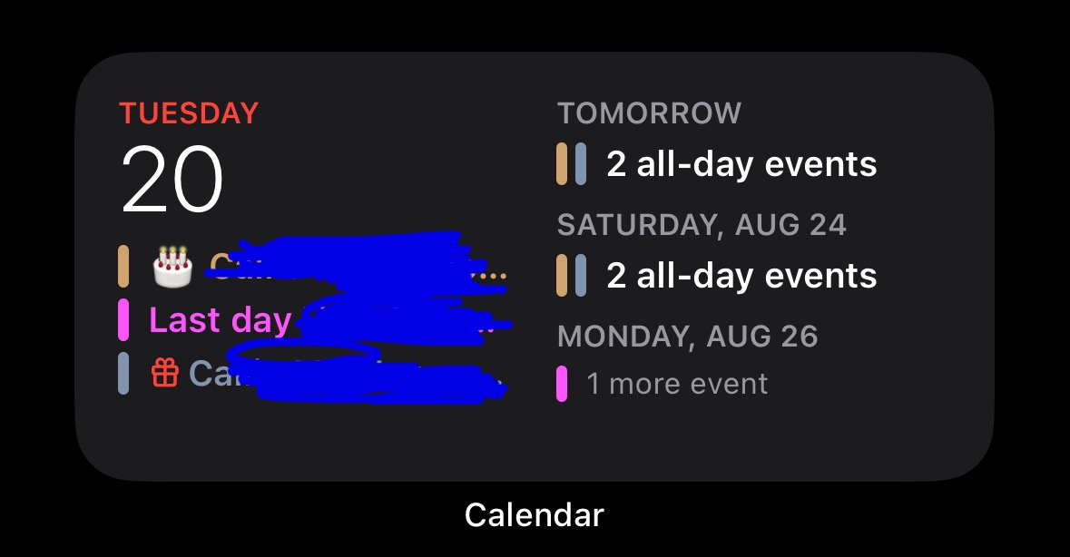
The most useless calendar widget is made by Apple. I constantly forget that someone’s birthday or something important is coming up later in the week.
Now I understand that you can set up alerts and you can set up reminders for stuff. I also understand that you can choose a different size widget. But depending on the size and the amount of events it’s possible it won’t even show you what’s going on the next day in the larger widget as well.
This is forced me to use third-party widgets to display calendar events for the week on my home screen. I hate it because I have no idea if it’s stealing my data.
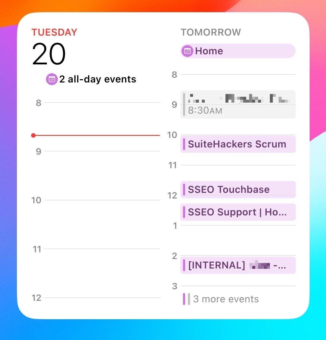
Bonus Edit! The large widget fails to show you what’s happening today!

You must log in or register to comment.
Completely agree, this is garbage, and I’ve bitched about it in the past. Annoyingly, both the Gmail and Outlook widgets are far better, but I don’t want either of those on my phone.
I don’t understand It anyway - what’s going on in the IT companies that come up with this? Microsoft Outlook isn’t better. In any case, a meaningful view for us “Europeans” is not adjustable: There is either too much useless information at the overviews in these calendars, the wrong information given or way too little. Like this: Week starts at Sunday, Degrees in Celsius, Month-Day-Year Dates and “Yesterday, Tomorrow” as Day description, instead it should be Tuesday 20, Wednesday 21, Friday 22. And not crap like this: Actual day is shortened down and there is Saturday in this view! WHY?
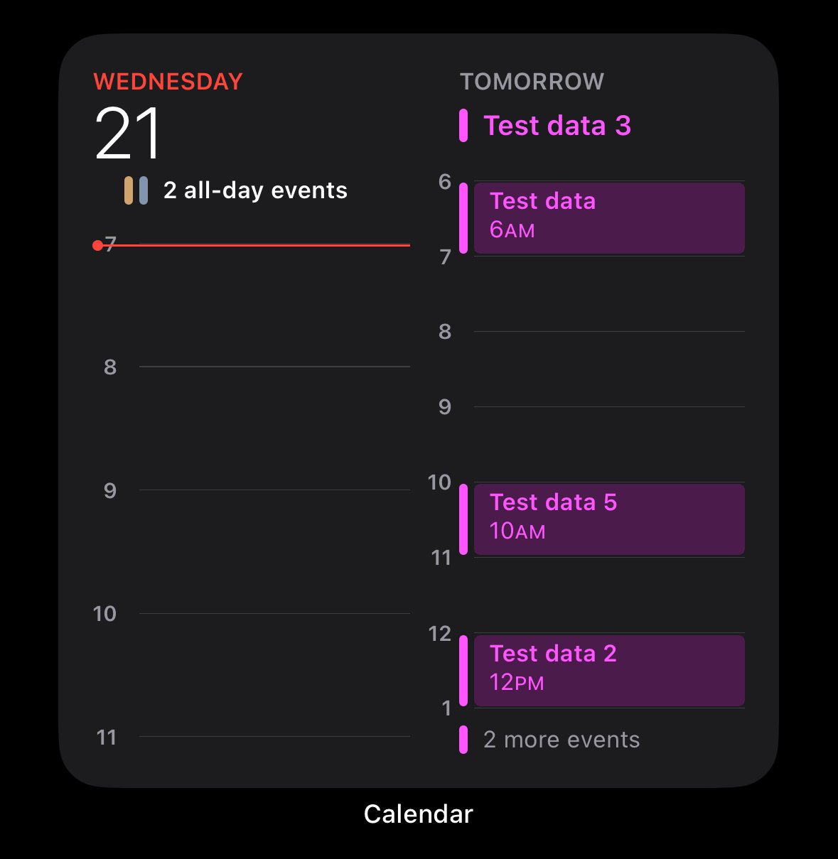
I agree. Luckily the iOS 18 one is a little better.
It still looks terrible IMO.
Edit:
I agree. Luckily the iOS 18 one is a little better.
It’s not differentl. It’s the same as iOS17.
Why it’s terrible.
- What are the “2 all-day events”?
- Why is HALF of the widget wasted white space.
- why are there 3 more events if half of the widget is wasted white space.
Edit: I’m familiar with the widget. I don’t need someone explaining to me how to click on a widget. I get it. I also understand it’s different than the one I posted. It’s called “Up Next”.
Despite which one you pick, they’re all poorly designed. It takes up a third of the screen and does a bad job at presenting as much information as possible within reason.
Edit 2: That specific calendar widget you posted from ios18 beta looks exactly the same as it does in ios17. This thread is pointless.
iOS 18 is in beta, which means you should be using the Feedback app to report stuff like this. Apple has actually been very good at responding to me about stuff like this, so I actually encourage you utilize the app.
I’m not running iOS18 beta. I don’t have an app called Feedback. ???
And for the record, the specific calendar widget the user posted from iOS 18 looks exactly the same as the one in iOS 17.
This whole thread is pointless.
Yeah the “whole thread” goes off about iOS 18, so my bad for assuming people were using iOS 18. 😒
Though you’re right, the entire thread is pointless. I’m considering blocking this community because it feels like everyone’s got an attitude problem.
Way too much emphasis on making it look like a calendar app. It should just be a list at that point.
The problem is a lack of emphasis. Apple routinely completely ignores basic features and UXD in their apps, for years. If you don’t want to use an app in the exact rigid structure they want you to, you’re gonna have a bad time.
That’s why I only use a handful of Apple apps — the apps that have no possibility of vendor lock-in, and can be instantly replaced on any other OS (e.g. calculator — which also fuckin sucks for anything beyond basic arithmetic).


